Clarity
Designed a 5-screen SaaS dashboard that reduces academic fragmentation for students.
"Students don't struggle because they lack tools — they struggle because their tasks are scattered across too many places."
A web-based academic productivity platform that centralizes assignments, attendance, and progress tracking into a single structured system.
Students juggle assignments across WhatsApp, Google Docs, and portals — with no central view, missed deadlines, and constant mental overload.
A unified dashboard that centralizes tasks, attendance, and progress — eliminating the need to switch between tools.
Reduced cognitive load, improved deadline visibility, and a single source of truth for every academic responsibility.
Explore the full interactive prototype
View Prototype →Students are drowning in tools — and still falling behind
Students struggle to manage academic work across multiple tools, leading to confusion, missed deadlines, and lack of clarity.
Talk to any college student and you'll hear a familiar story. Assignments are shared in WhatsApp groups. Lecture notes live in Google Docs. Personal to-do lists are scribbled in notebooks. Deadlines get announced verbally in class and then promptly forgotten. Attendance is logged somewhere in the university portal — a place most students visit only when it's too late.
The result isn't laziness. It's a system that was never designed to work together. Students spend more energy tracking where their information is than actually acting on it. The stress isn't about having too much work — it's about never knowing exactly what the work is, where it stands, or what comes next.
The real problem is not productivity. It is visibility — and the mental cost of living without it.
The real cost of fragmentation
When academic information is scattered, it doesn't just cause inconvenience — it has measurable consequences on students' performance and well-being:
- Missed deadlines — Assignments and due dates spread across portals, group chats, and emails slip through the cracks, directly affecting grades.
- Increased stress — Managing multiple disconnected tools demands constant mental overhead, raising anxiety around academic responsibilities.
- Lack of visibility on progress — Without a unified view, students cannot accurately assess where they stand, making it hard to prioritize and stay motivated.
What I worked on
I worked on this project independently as a UX Designer, taking full ownership from understanding the problem to delivering a clickable prototype. My responsibilities spanned the entire design process:
- Research — Spoke with 3–5 students to surface real pain points around fragmentation, missed deadlines, and tool overload.
- Wireframing — Designed low-fidelity wireframes to establish layout, structure, and information hierarchy before visual decisions.
- UI Design — Built a polished high-fidelity interface with a consistent design system, deliberate visual hierarchy, and purposeful color.
What students actually said
Before touching Figma, I spoke with 3–5 students to understand how they actually manage their academic work day-to-day. I didn't ask hypothetical questions — I asked them to walk me through their last week. The patterns were immediate and consistent.
- Most juggle WhatsApp groups, Google Docs, handwritten notebooks, and a university portal simultaneously
- There is no single source of truth — every source only shows part of the picture
- Students miss deadlines not because they ignore them, but because information loses visibility over time
- Progress is never visualized — students have no real sense of how far they are through a semester
- Attendance and assignments live in completely separate systems, making it impossible to see the full academic picture
Key Insights
Insight 1 — Students switch between 3–5 different tools daily just to stay on top of academics. Every context switch adds cognitive load and increases the chance of something slipping through.
Insight 2 — Deadlines aren't forgotten — they lose visibility. A WhatsApp message gets buried. A notebook page gets skipped. A Google Doc isn't opened again. The problem is information architecture, not student effort.
Insight 3 — When students can't see their progress, they either overestimate how on track they are, or feel overwhelmed without knowing why. A clear progress view reduces both false confidence and unnecessary anxiety.
Students don't need more tools. They need one place that shows them everything — clearly, instantly, without effort.
Core finding: students have enough tools — what's broken is the workflow
Students already have calendars, messaging apps, note-taking tools, and university portals. Adding one more app was never going to help. The real issue is that none of these tools talk to each other, and students are left to be the connective tissue between them — mentally juggling context across every platform, every day.
The real problem wasn't lack of tools — it was fragmented workflows. Students were switching between multiple platforms, increasing mental load and reducing clarity.
Fragmented workflows — not missing features — are what cause missed deadlines and academic stress. When the same assignment appears in a WhatsApp message, a verbal reminder, and a university portal but never in one consolidated place, it will inevitably slip. Fixing the workflow is the only design move that addresses the root cause.
This reframed everything. The design goal wasn't to build a smarter to-do list. It was to eliminate workflow fragmentation itself — to create one coherent space where the information students already have becomes immediately visible, prioritized, and actionable without any extra effort on their part.
Why this solution works
The core insight was this: students don't need another tool to learn. They need the information they already have to be in one place, surfaced clearly, without requiring effort to maintain.
Clarity consolidates the most critical academic signals — assignments, attendance, and progress — into a single dashboard. But the design choices go beyond grouping features. They address specific behavioral patterns observed in research:
- It reduces switching cost. Every time a student moves between WhatsApp, a Google Doc, and a university portal, they lose context and add friction. Clarity eliminates that switching entirely — less friction means less dropped information.
- It makes deadlines impossible to ignore. By surfacing upcoming assignments directly on the dashboard, urgency stays visible at all times. No searching, no digging — the most important information is front and center.
- It turns invisible progress into a motivator. Seeing completion percentages and streaks gives students a tangible sense of movement. Research shows that visible progress is one of the strongest drivers of continued engagement.
- It respects existing behavior. Clarity wasn't designed to force new habits. It was designed to fit around the way students already think about their day — reducing the learning curve and increasing the chance of adoption.
Why I made specific choices
Why a dashboard approach?
A dashboard was the right entry point because it directly answers the question every student has the moment they open the app: "What do I need to do right now?" Rather than requiring navigation to gather information, the dashboard surfaces the most critical signals upfront — reducing cognitive load on every visit. The less mental effort it takes to get an overview, the more likely students are to actually use it consistently.
Why a simplified layout?
Students already feel overwhelmed. An interface that looks cluttered or requires interpretation becomes another source of stress rather than a solution to it. I chose a simplified layout — limited color, generous whitespace, and focused content areas — specifically to improve scannability. A student should be able to open Clarity and understand their academic situation within seconds, not minutes. Every element that doesn't earn its place on screen was removed.
Why clear visual hierarchy?
In a tool like this, visual hierarchy isn't decoration — it's function. When everything is styled equally, nothing communicates urgency. I used size, weight, and color deliberately so that high-priority items (an assignment due tomorrow, low attendance) are immediately distinguishable from background information. This minimizes the user effort required to identify what needs attention and reduces the risk of something important being overlooked.
Why prioritize today's tasks?
Instead of treating all tasks equally, I prioritized "today's tasks" so users can focus on what matters immediately and avoid feeling overwhelmed.
Showing everything at once creates overwhelm. Showing only what matters today creates focus. The dashboard surfaces assignments due within 24 hours at the very top — a deliberate decision to reduce cognitive load at the exact moment students need clarity most. Instead of scanning a full semester's worth of tasks and manually filtering by urgency, students immediately see what demands attention right now. This single design choice directly addresses the mental overload of staring at a long, undifferentiated task list and not knowing where to begin.
How I built it
Problem Definition
Defined the core problem through student conversations: fragmented academic information and zero visibility into what matters today.
User Flow Mapping
Mapped the main user flows — viewing assignments, creating tasks, tracking progress, and monitoring attendance — to ensure a connected system, not isolated screens.
Low-Fidelity Wireframes
Built low-fidelity wireframes focused on layout, information hierarchy, and usability — establishing structure before any visual decisions.
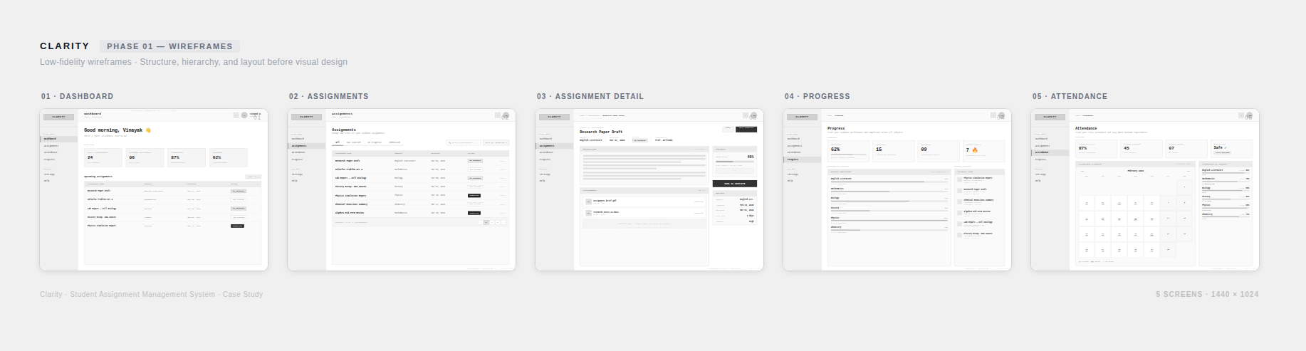
Phase 01 — Low-fidelity wireframes exploring structure across 5 screens
High-Fidelity Design
Designed a clean, high-fidelity interface with deliberate visual hierarchy, consistent spacing, purposeful color, and simple navigation.
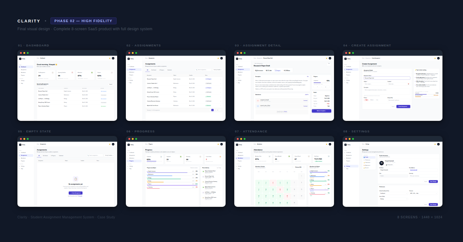
Phase 02 — High-fidelity design across 8 screens with full design system
Prototyping
Connected all screens into a clickable prototype to validate key flows and interactions. Explore it here →
The final product
Five key sections designed to reduce mental friction and improve visibility rather than add new features. Each screen serves a deliberate purpose tied directly to a student pain point identified in research.
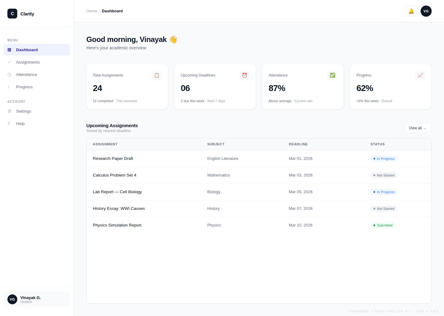
Dashboard
What it does
Centralizes assignments due within 24 hours, completion progress, and current academic standing on a single opening screen — with today's urgent tasks always at the top.
How it helps
Students know exactly what demands attention right now without opening a single other app. The mental overhead of piecing together a daily plan from WhatsApp, Google Docs, and a university portal disappears.
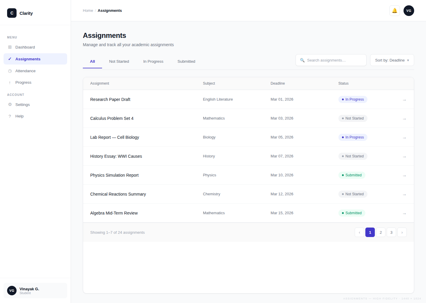
Assignment Management
What it does
Brings assignment creation, status tracking, and deadline filtering into one dedicated view — no external apps required.
How it helps
Students stop cross-referencing WhatsApp, Google Docs, and portals to find out what's due and when. All deadlines are in one place, always current, always visible.
Progress Tracking
What it does
Tracks completion percentages and learning streaks across all subjects, updating automatically as assignments are marked done.
How it helps
Students gain a concrete sense of forward movement — something entirely absent when using disconnected tools. Visible progress is one of the strongest drivers of continued engagement, and this screen puts it front and center.
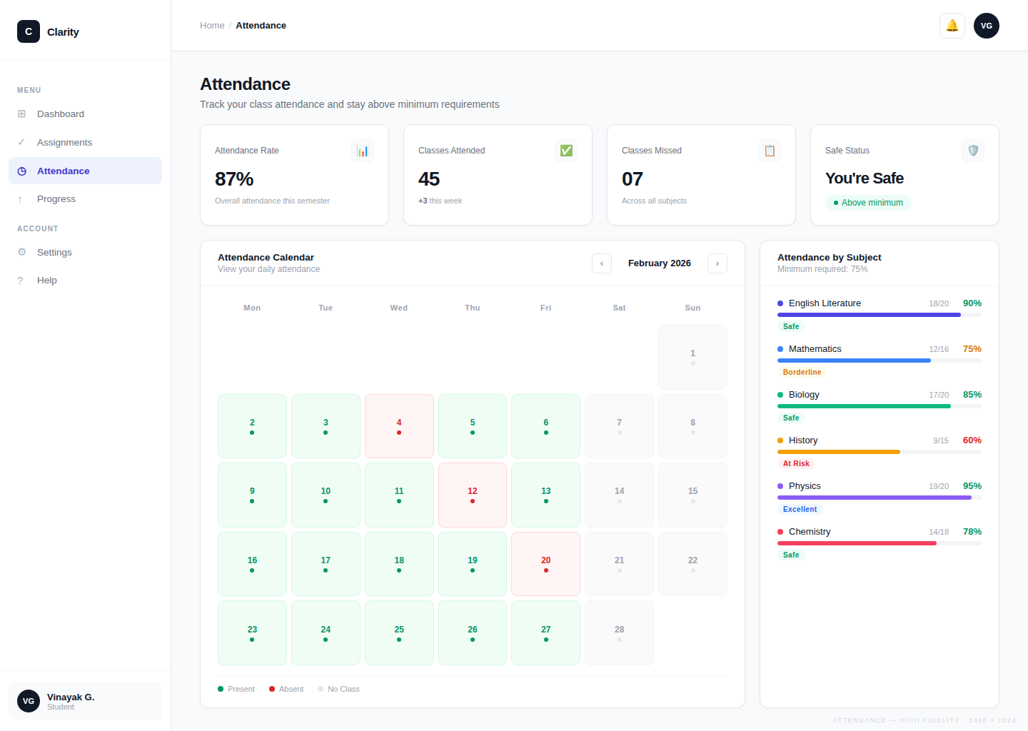
Attendance Monitoring
What it does
Displays attendance percentages per subject alongside assignments in the same interface, pulled out of the separate university portal.
How it helps
Students spot attendance gaps early enough to act — instead of discovering a problem only at the end of semester when it's too late to recover.
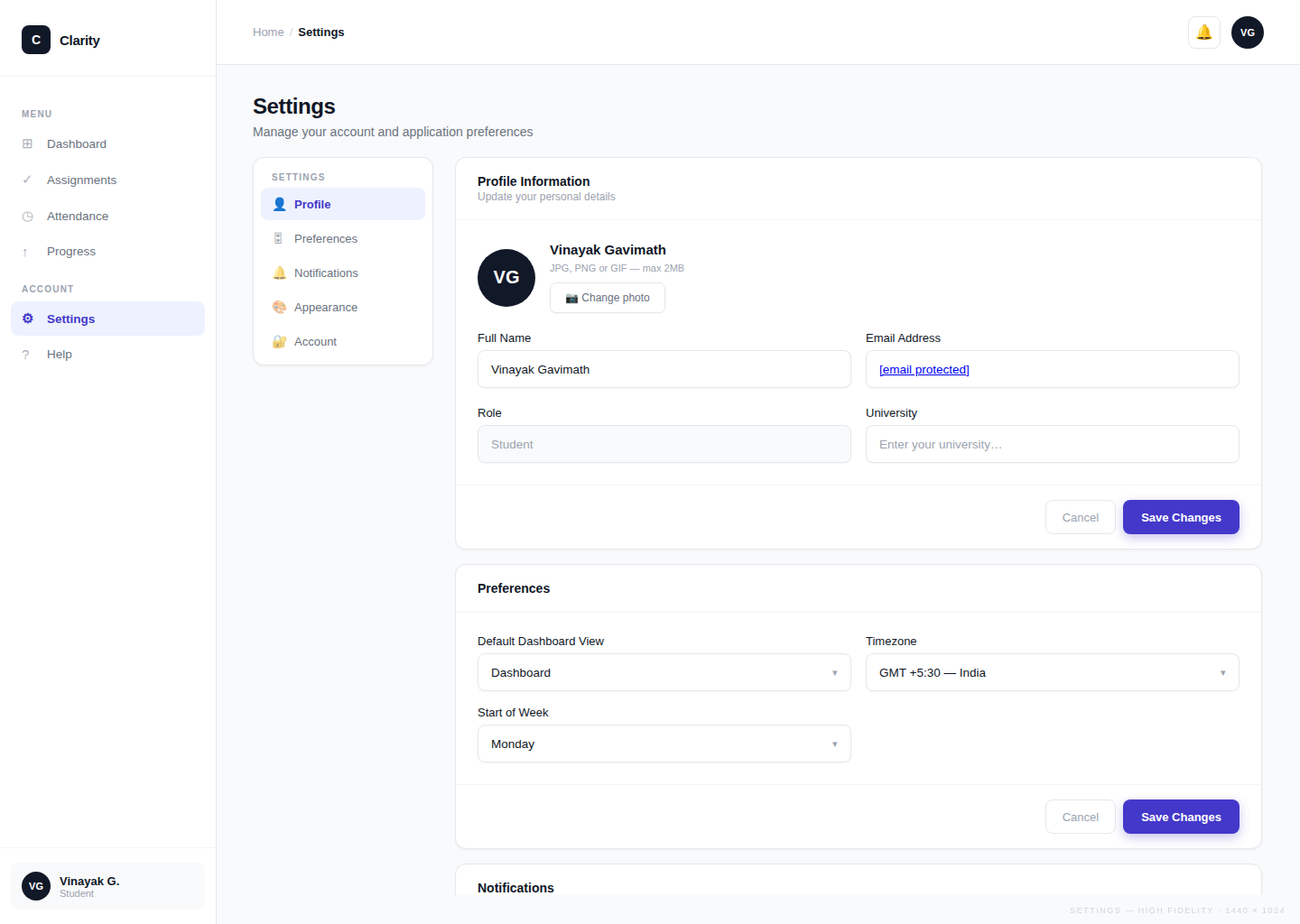
Settings and Personalization
What it does
Lets students configure notification preferences, subject lists, and how progress is measured — tailoring the tool to their academic context.
How it helps
A tool that reflects each student's specific situation gets used consistently. Personalization reduces the friction of adoption and increases the chance the tool becomes a daily habit rather than something opened once and forgotten.
What changed for students
The shift Clarity creates isn't just visual — it's a fundamental change in how students experience their academic day. Comparing the two states makes the design rationale concrete.
- Check WhatsApp groups for assignments buried in conversation threads
- Open Google Docs, notebooks, and portals separately to piece together a picture
- Manually track deadlines — frequently missed when information loses visibility
- Attendance checked in a separate university portal, usually too late
- No sense of overall progress — semester feels like a blur
- High cognitive load: energy spent managing tools, not doing work
- One dashboard — all assignments, deadlines, and priorities visible immediately
- Today's urgent tasks surfaced upfront; no scanning or searching needed
- Deadlines always visible with status indicators — nothing slips through
- Attendance and assignments in the same view — full academic picture at a glance
- Progress tracked automatically — streaks and completions visible at all times
- Low cognitive load: less time managing information, more time on actual work
How this helps students
Clarity is a conceptual project, but it was designed with real outcomes in mind. Based on the problems identified in research and the design decisions made, the expected impact is:
- Fewer missed deadlines — A centralized, always-visible assignment list with status indicators removes the "out of sight, out of mind" failure mode that causes students to miss work.
- Reduced daily cognitive load — By eliminating the need to context-switch across 3–5 tools, students spend less mental energy on information management and more on the actual work.
- Better self-awareness — Progress tracking and attendance monitoring give students an accurate picture of where they stand, enabling more informed decisions about how to prioritize their time.
- Lower stress around academic responsibilities — Visibility reduces uncertainty. When students can see their situation clearly, they feel more in control, which research links directly to reduced academic anxiety.
After sharing the concept with students, the centralized dashboard was seen as the most valuable feature — not because it adds new capabilities, but because it eliminates the need to switch between LMS portals, messaging groups, and personal notes just to get a basic overview.
The goal was never to build a feature-rich platform. It was to make students feel less overwhelmed and more in control of their academic lives.
What I learned
- Start with behavior, not features. The most useful design decisions came from understanding how students actually behave — not from brainstorming features. Mapping the real tools students use (WhatsApp, Google Docs, notebooks) before designing anything made every subsequent choice more grounded and defensible.
- Reducing friction is a design feature. The biggest UX wins in this project weren't about adding things — they were about removing them. Every time I cut a layer of navigation, simplified a layout, or consolidated two separate actions into one, the product became more usable. Less is genuinely more when cognitive load is the enemy.
- Visual hierarchy is product strategy. Deciding what to show first, what to make prominent, and what to de-emphasize isn't a visual design choice — it's a product decision. Getting the hierarchy right meant students could act on urgent information instantly, which is the entire point of the product.
- Simplifying complexity is the hardest design skill. It's easy to add — a new feature, a new screen, a new option. It's much harder to resist. Every simplification in Clarity required actively choosing what to leave out. The most impactful moment wasn't designing a new feature; it was removing a redundant one. Designing for clarity over completeness is the discipline I'll carry into every future project.
Good design is not about adding more features, but about reducing complexity and helping users focus on what truly matters.